
Alpro.com website redesign
Role
Design Lead
Client
Alpro
While working at Appnovation, I led the design of a pitch proposal for the redesign and launch of the new alpro.com website, alongside their new brand launch. After a successful pitch presentation and winning the project, I was brought in as the Design Lead and worked in the project from the discovery stage, all the way to final delivery. During that time my responsibilities included serving as a Design Lead, where I produced visual designs, prototypes, and small animations of UI interactions. I also set the design direction, led a team of three designers, helped define the design work roadmap with the PM, created presentations, and presented our work to clients, all while seeking feedback and continuously improving our designs.
Brand new look
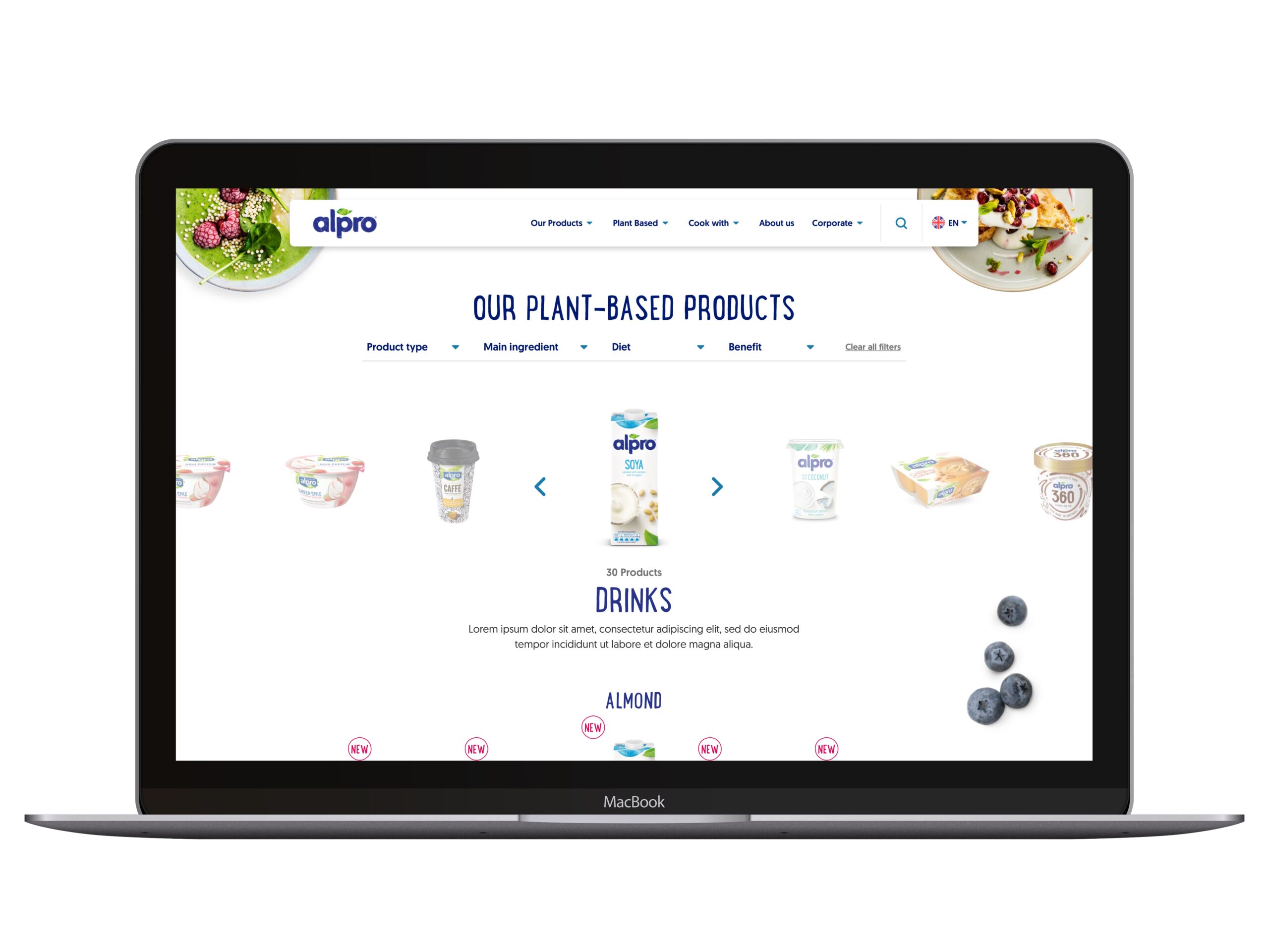
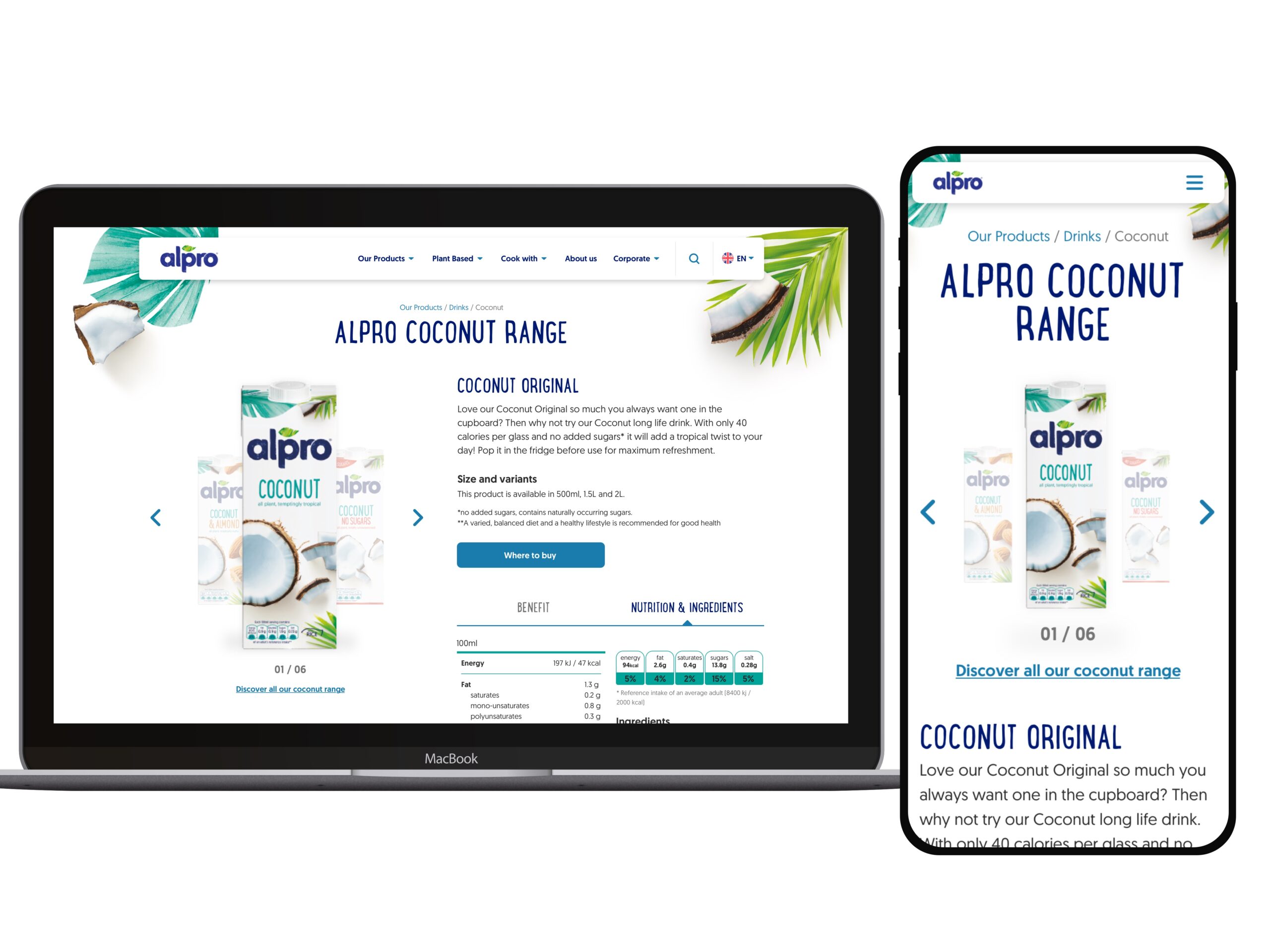
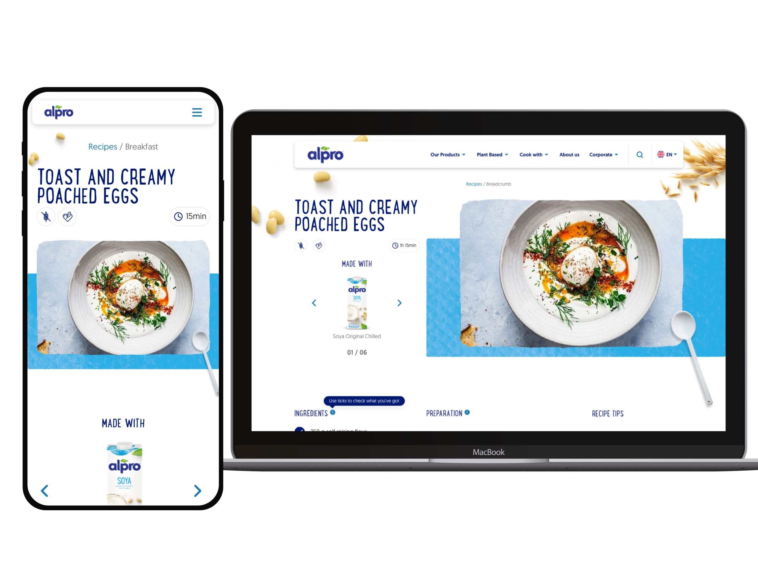
One of the main goals of this project was to redesign the website as part of the overall rebranding process. Using the new brand assets and packaging as resources, we've used the ingredients and product colors as key items of the new design.
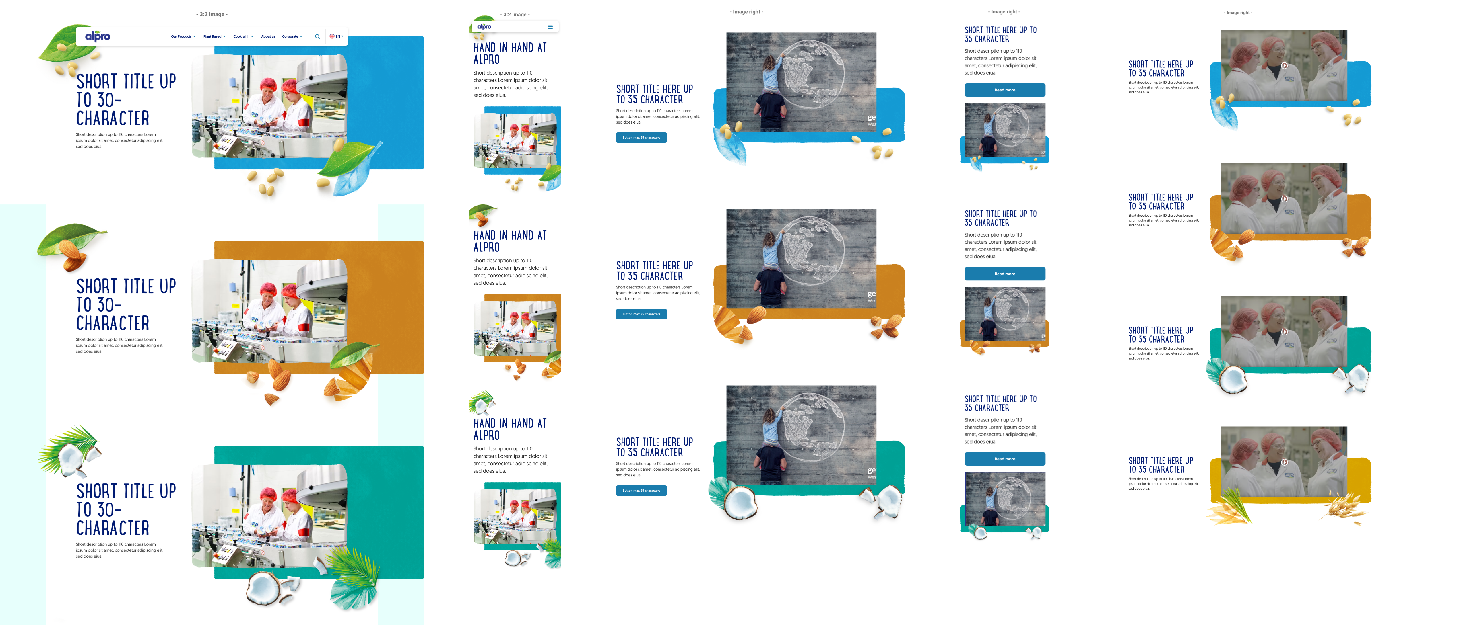
The use of textures and ragged edges brings a more natural element into Alpro's online language, similar to the one used in packaging and branding collaterals.
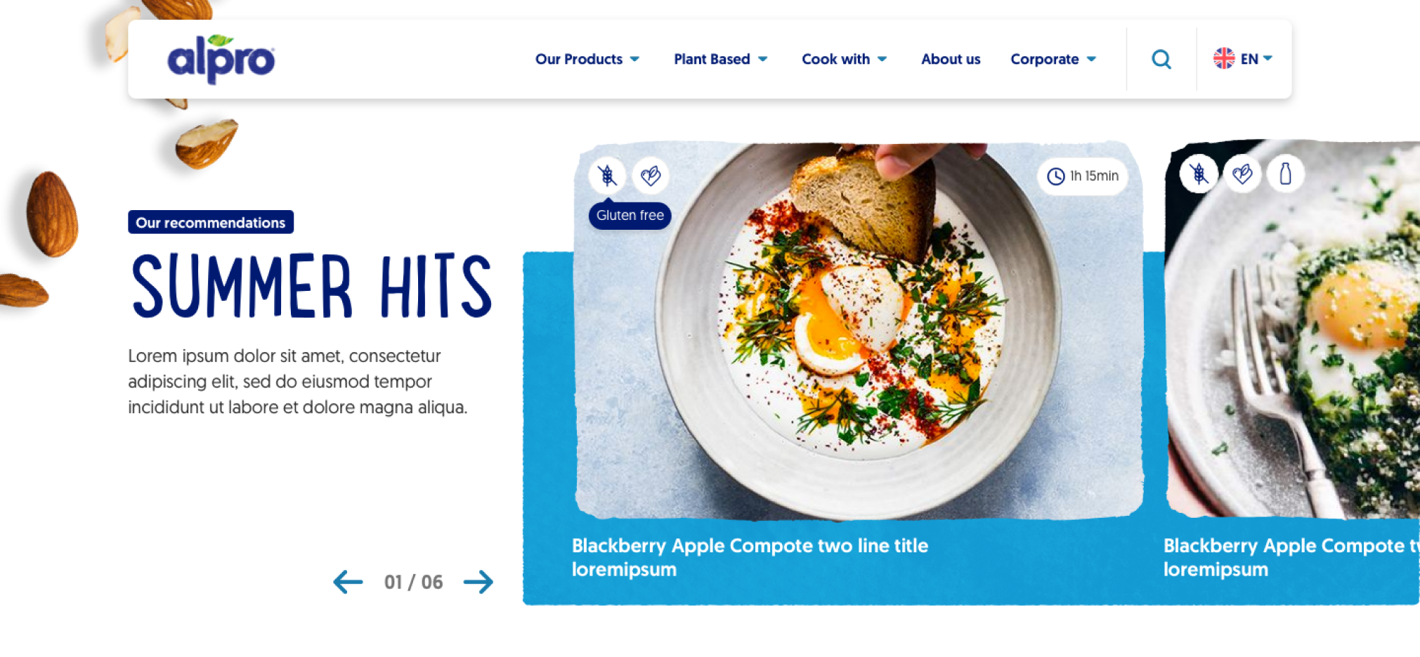
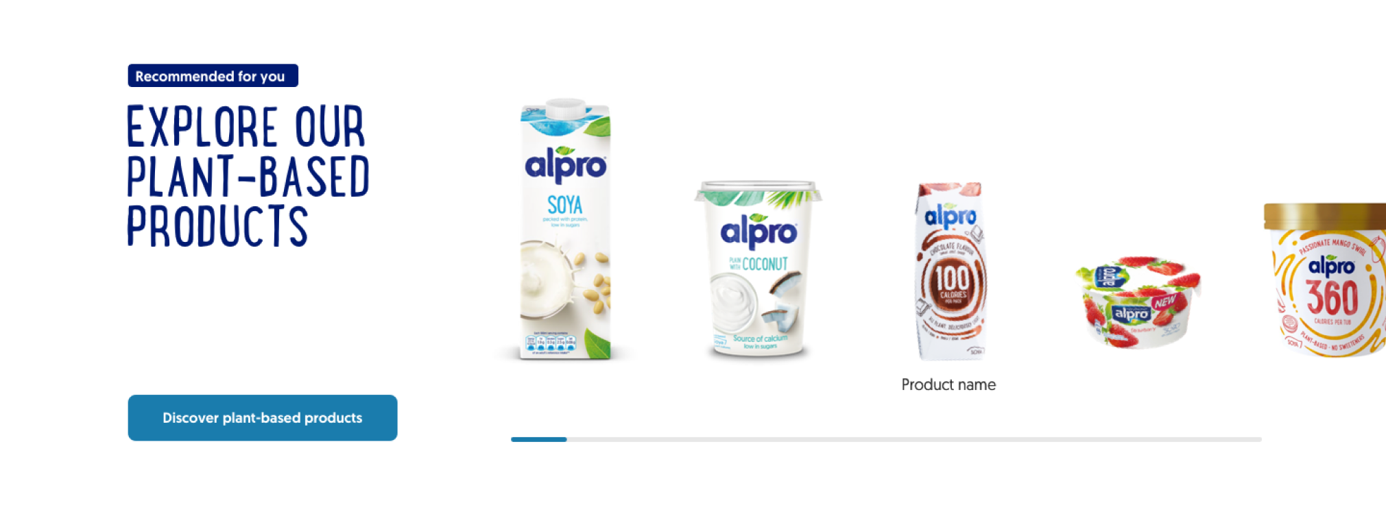
To enable product discoverability and engagement of the users, we suggested multiple ways on how to feature and recommend different products throughout the website. The "explore our products" component was designed to feature at the end of a page, to enable the users to continue navigating on the website and to hopefully discover some of the new products that Alpro has to offer.
Mobile first
One of the overall guiding principles on this project was to create a great experience on mobile, using as many mobile interactions as possible, using swiping in carousels and galleries, while also enabling a great desktop experience by offering alternative methods of navigation.
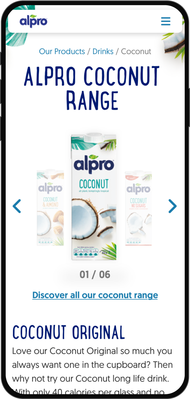
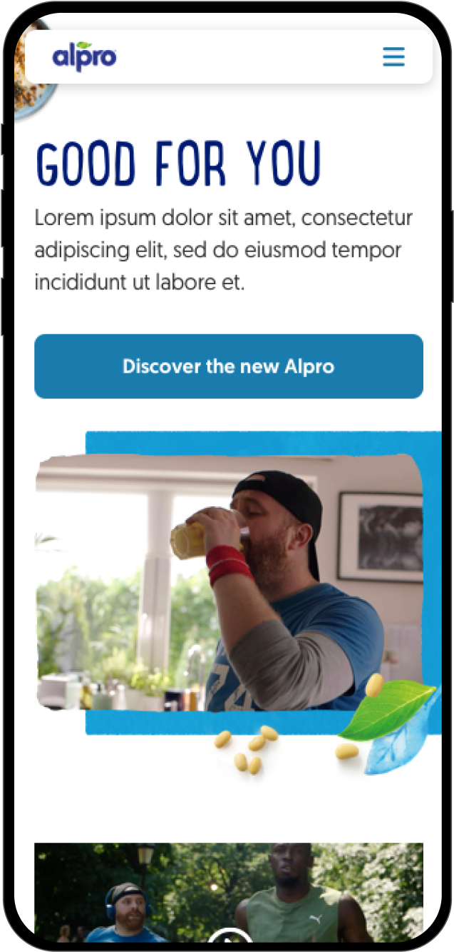
With a challenging deadline, 30+ countries to deliver to, a component library to create to templatise our design into a CMS and with a new and responsive design to create and approve with several stakeholders, this was a complex project but one that led to a very happy relationship with the client and a great end result.
Micro-interactions
We explored all details of the design and how micro-interactions could be developed to bring an extra layer of engagement and delight to the users navigating the website.
Component library
Built on top of a CMS platform, we created modular components into a component library that allowed the client to easily put together a website by re-using existing components and customising it for their exact needs. Colour and asset variations, different type of content and features and variations of layout, allowed to create engaging pages with incredible ease. In a global corporation with over 30 countries and multiple languages, this was key for the client to create multiple websites in a short time, all the while keeping the brand consistency and the same user experience.
To wrap it up, the Alpro.com project was a big win thanks to our whole team putting in hard work and dedication, from the designers and project managers to the developers. We didn't just meet but totally knocked out of the park the client's expectations, and they were thrilled with the results. They liked our work so much that they want to keep working with us even after this project. This project shows we're pretty good at what we do and can make clients happy, which bodes well for even bigger successes down the road.
Let's chat.
Based in London & Oxford, UK
Phone +44 7454 719 656
Email antonio@pratas.co
Twitter @antoniopratas
